The problem with Corel Painter…

Ever since I started Digital Painting the question of which piece of software to use has bugged me incessantly. A poor workman blames his tools and a good workman can produce good work with just about anything (or so they say) but personally I think if you’re going to spend loads of money on piece of software and loads of time using it then it’s in your best interests to make sure you pick the right one from the onset.

If I recall correctly when I first started digital art I was using Photoimpact 10, which was like a dumbed down version of photoshop. After a while I progressed to Photoshop elements 2.0, which was a dumbed down version of Photoshop, but perfect for learning the fundamentals. After I got my first graphics tablet and started painting digitally for real (rather than just colouring scanned line art) I ended up using Corel Painter 9.

Corel Painter had quite a few annoying bugs but as someone that had been working purely traditionally until not lot long before, the traditional media emulation was much friendlier than Photsohop’s daunting brush system. So I used Painter almost exclusively despite the irritating bugs. So when Painter 10 came out I was pretty excited and downloaded the trial version straightaway. I was dismayed to find it was even more buggy than painter 9! So I stuck with version 9 and had my fingers crossed when Painter 11 came out that it would be good. It wasn’t. The chaps at corel had managed to make it even more buggy! (in my experience of using it)

So I eventually got sick of Corel’s outdated and under-tested software and when Photoshop Cs5 came out boasting a new brush system I decided I had to try it. The whole Photoshop painting experience was just so much smoother than painter that I’ve been using it ever since. I’d pretty much given up on Painter.

And now Corel Painter 12 has just been released! I was sceptical that it would be very good, and that the bugs would be fixed. So I downloaded the trial and gave it a go…

…And it’s still riddled with a pox of bugs and performance issues. Nice brushes, but it’s just not worth the tradeoff for any professional. Stick to Photoshop, that’s what I say. At least until Corel decide to test their products properly.

I wanted it to be good. I really did! 🙁
Daily Deviation

Today marks a historic occasion in the history of my artistic and creative career!

My painting “Gill the Queen of Fishes” has been officially recognised today as rather good over on deviantART and awarded a daily deviation. if you haven’t seen the picture, it can be seen here

I shall post the accompanying poem here, as I reckon it needs more exposure. It took me at least 2 hours to write that!

At the top of a hill, in a house on the cliff
Overlooking the vast sapphire sea
Lived a lady called Gill
Regarded still, as barmy as could be

For it was Gillian Finney’s greatest wish
To own one of every single fish
The fat, the thin, the square, the big, the really small
Even those shaped like a dish, the crazy lady wanted all!

Come rain or shine or storm or hail she’d sit beside the sea
With a butterfly net getting rather wet and then go home for tea
Her catch she’d place in tanks of every shape and every size
The poor souls that she’d caught before would end up in fish pies.

One successful sunny day she caught a massive whale
She rolled her sleeves up, held on tight and dragged him by the tail
When she reached her house atop the hill and in his tank he went
She was far too tired to notice that that the floor had somewhat bent

That night while reading anglers weekly she heard a curious creak
As the water soaked her slippers she realised a leak
Had sprung up in the largest tank and now the glass was cracking
A blast of water later and poor gill was soon sent packing

Cascading down with Gill came every fish and every tank
And as she hit the water neath the cliff and promptly sank
Ironically her thoughts took on a slightly new direction,
That maybe she could now
Somehow
Be part of whale’s collection?

You can also buy a signed print of the artwork on my shop page, should you require one.

Crazytown

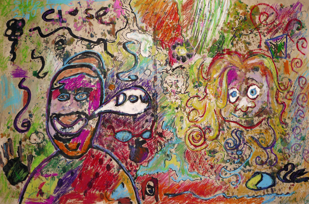
Today I present a collaborative piece by myself and my sister Ellie (aged 7) I have to say, it’s one of my better efforts.

Crazytown

It’s refreshing to work so directly with another artist, you get a wonderful mix of influences and approaches within the single piece. It was a hell of a lot of fun to do too, I reccommend all those with a younger sibling seek thier artistic expertise at some point.

The piece itself (titled Crazytown) is mixed media; ink, oil pastel and melted crayons. A1 in size on brown paper.

How to make a Children’s book

Once again that time has come when the frantic dash to get all my projects finished for uni is over. Another year, another £3000. Still I can’t complain, the poor buggers starting next year will have to pay £9000 so by comparison my university education is a bargain!

So what have I learned this year? I’ve learned to always allow half a day to get things printed when deadlines are close and I’ve also learned how to make a Children’s book. I’d love to be a Children’s book illustrator, its the perfect job for spending all your time painting bizarre colourful illustrations of fantastical stuff. My kind of thing basically.

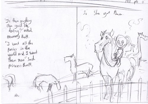
The basic thumbnail for pages 5-6

Our final uni project of the year was a brief taken from the Macmillan Children’s book prize; to illustrate a children’s book. That meant pencil sketches of every page including cover and end-pages along with 4 full colour completed double page spreads. A lot of work for the short time we had. nonetheless, I had a damn good go!

The first thing you need to illustrate a kid’s book, is a kid’s story, so I wrote one. It was loosely based on my rather spoiled little sister and was titled “Princess Bratt’s birthday”.

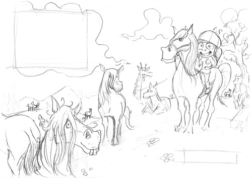
The pencil sketches for pages 5-6

The next step was to come up with thumbnails for every page, so I knew how to approach the pencil sketches and where to position the text and all the compositional elements. This is perhaps the most challenging part of the process since it’s the foundation you build the rest of your artwork on and requires the most thought and planning. I had of redo several of them before I was happy with the flow.

Stage three, pencilling. This is where I spent a lot of time wondering why I wrote the daft story I did and doing my best to draw lots of stuff clearly enough to be interpreted visually by the potential publisher. It was easier than the thumbnails but a lot slower to do. You can see on the sketch the rough boxes where I’ve left space for the text. When I came to actually adding the text I found I’d left more space than I needed. It occurs to me that it would have been smarter if I’d mapped out the text on the computer after the thumbnail stage so I could see exactly how much space I’d need. Still, I’ll remember next time.Ponies

The final image without the text is above. The painting stage was all done in photoshop with custom brushes.