Blog

Huion Kamvas Pro 13 (2.5k): An artist’s review

Huion have been kind enough to send me one of their new tablets- a Huion Kamvas Pro 13 (2.5k) for me to review. I received this tablet for free, but the following thoughts are my own honest opinions.

The box for the Kamvas Pro 13 (/2.5k)

Having previously reviewed the XP Pen Artist 22 (2nd Generation) pen display I’m interested to see how this compares. Let’s get stuck in!

Here’s what’s in the box:

  • The Kamvas pro 13 (2.5K)
  • Pen
  • Pen holder
  • 5 Standard Pen nips
  • 5 Felt Pen nips
  • Pen nip remover clip
  • USB-C to USB-C cable(1m)
  • Main 3-in-2 cable (1.5m)
  • Extended Cable (1m)
  • USB Power Cable (1m)
  • Foldable Stand
  • Artist glove
  • Cleaning cloth
  • Quick start guide

First setup

I didn’t have any problems with setup- it was a simple matter of plug and play, followed by a driver download and install.

The main “3 in 2” cable works with 2 USB ports, one for power, one for data, plus a HDMI cable for the display. Apparently you can also run the tablet from a single USB C cable, though I didn’t test this.

The Kamvas Pro 13 (2.5k) cables and artist glove
The cables and artist’s glove

One gripe I have with this tablet is that the main cable (1.5 metres) is a bit shorter than I would like. It was just enough to reach from the tablet to my PC under my desk. It does come with a USB extender cable for one of the USB A inputs, so you can easily extend that, but you are still limited by the HDMI and the other USB cable. The driver install was easy and worked straight away.

The Display
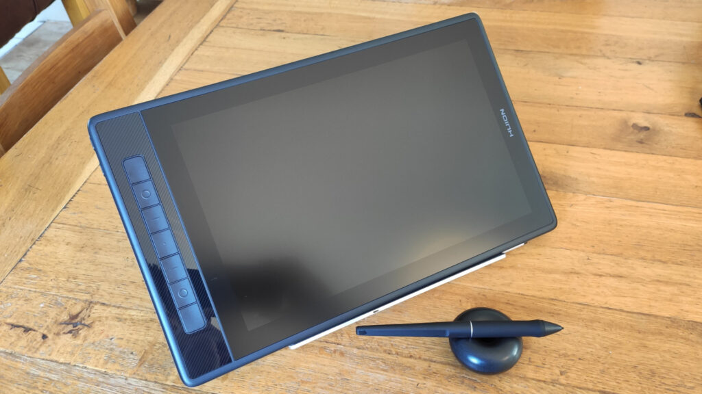
The Kamvas Pro 13 (/2.5k)

The screen quality of the Kamvas Pro is very good. It’s nice and sharp, though the etched glass does subtly diffuse some of the sharpness.

The picture quality in general is also very good and the screen has 145% sRGB coverage so colour reproduction isn’t an issue. I found the contrast to be good and the brightness to be adequate.

One feature I really like about this tablet is that holding the power button down brings an OSD menu up in the centre of the screen that you can adjust with the pen itself, rather than physical buttons on the edge of the display. I’ve always hated adjusting monitors with those damn buttons. This is much more intuitive!

The display is nice and thin- only 1cm or so in thickness. It has customisable express keys on the left side (I never use those but nice to have) The build quality feels sturdy, and it’s quite pleasant to hold.
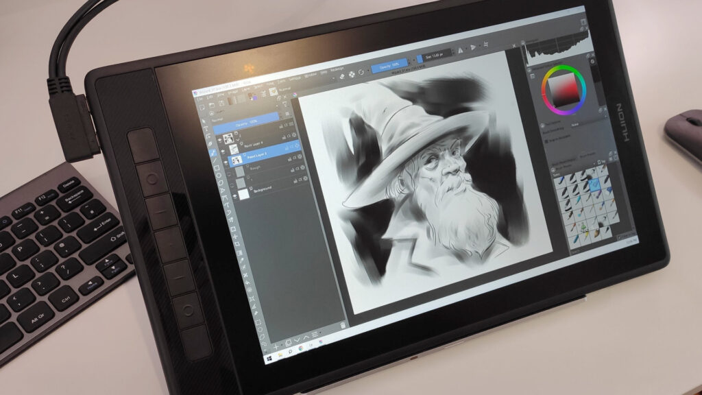
The Kamvas Pro 13 (/2.5k) setup and in use.

I don’t mean to go on about that cable- but I think left handed users wanting to use the express keys might find it a bit awkward if using the standard 2 in 3 cable- because of the way it juts out you can’t simply flip the tablet round as there isn’t enough room for the cable when it’s pointing down towards the desk

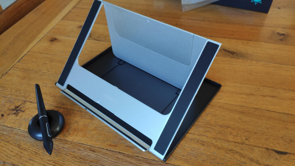
The display and the stand are two separate elements on the Kamvas Pro. The display is excellent, but the stand I’m less sure about. The aluminium body seems well engineered, but the plastic base feels a little less durable.
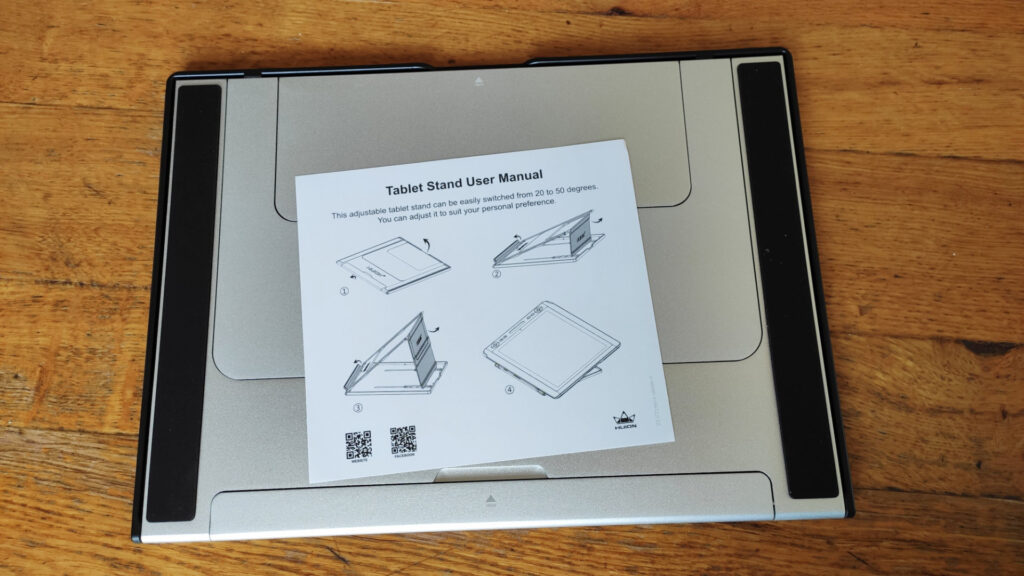
The Kamvas Pro 13 (/2.5k) stand folded up with the instructions on top.
The stand-folded up- with the instructions on top
The Kamvas Pro 13 (/2.5k) stand
The stand folded out and ready to go.

The Pen

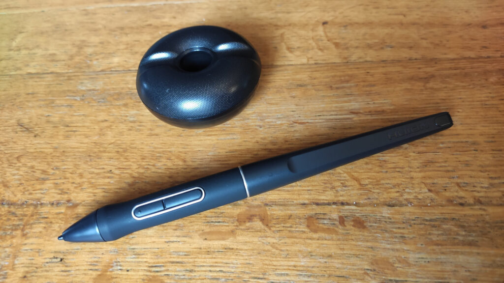
The The Kamvas Pro 13 (/2.5k) pen and pen stand.
The pen and stand

My initial impression of the pen is that it’s very similar to both Wacom and XP-Pen’s offerings, though it’s ever so slightly longer than either of them. It’s comfortable to hold and pleasantly balanced. It’s battery-free so doesn’t need charging.

The default plastic nib has good grip against the screen surface that makes it feel satisfying to draw with. There’s also felt nibs included in the nib-holder which I think I prefer because they’re softer and closer in feel to a real pencil.

I was very happy with the default settings for the pen pressure, and was able to make controlled, subtle lines and marks with no problem. Here’s a quick test drawing done in Krita:
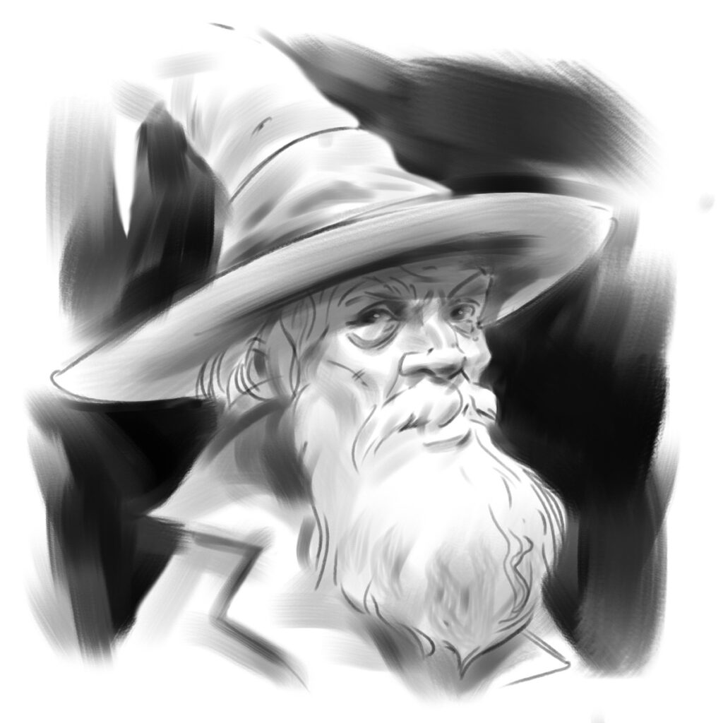
A sketch of a wizard with a big beard. Done with Krita on the Kamvas Pro 13 (/2.5k)
A quick test wizard.

Drivers

The drivers are very simple and easy to use. The UI is pleasantly modern and well laid out. They include the crucial option to add specific settings for specific programs. I don’t know if there’s a limit to the number you can add, but I tested it up to 15 different programs, which should be enough for anyone!

The classic options to specify the monitor working are and adjust pen sensitivity via a curve is also included.

A screenshot of the Huion driver software.

I encountered a strange situation where in the windows display settings the display was apparently 1920 by 1200 pixels, but I could clearly see just by looking at the UI on the tablet itself that it was actually running something much higher- presumably the intended 2.5k. Searching in the Huion drivers I couldn’t find any explanation for this, but ultimately it didn’t seem to present any problem so I just ignored it and moved on.

General experience

Unplugging the HMDI cable results in the display functioning as a traditional “old-school” graphics tablet. I like this feature because it allows you to switch up the ergonomics on long projects, so you’re not necessarily always bent over the tablet display. You could lay the tablet flat if you wanted, and use it that way.

I didn’t encounter any problems with pressure sensitivity not being recognised in the programs I tested with, or any ugly artefacts from the pressure input. One issue I did encounter is that the pen becomes slightly inaccurate (about a millimetre off) at the extreme corners of the screen. Running the monitor calibration tool in the drivers didn’t resolve it. This is unlikely to be a huge issue for most use, but it does make it awkward to click small UI elements at the corners of the screen.

Conclusion

The Huion Kamvas Pro 13 (2.5k) is a capable tablet for those who don’t have the space or budget for something a bit larger, or for artists who want something a bit more portable than a heavy pen display. I’d also say it’s a good option for up-and-coming artists.

The biggest strengths of this tablet are its picture quality, and the pen feel- both of which are excellent.

If you’re interested in purchasing a Huion Kamvas Pro, or having a more detailed look at the specs then the links are below:

Huion store: https://bit.ly/4cFaOfp

Specifications: https://www.huion.com/products/pen_display/KamvasPro/kamvas-pro-13-2k.html

Sir Radzig’s Sword

If you’ve played Kingdom Come Deliverance you may recognise this sword:

It’s the sword of Sir Radzig Kobyla- who has both the coolest sword and the coolest haircut in the game.

I initially made this model as a mod for the VR game Blade and Sorcery. It took me some time to figure out the best way to make certain elements, like the the wire inlay around the leather grip, and the decorative elements on the pommel. It was modelled in Blender, and textured in Substance Painter and photoshop.

Ultimately I’m pretty happy with how it turned out. You can download from sketchfab here– (non-commercial use obviously)

Under Cover: An Art Debrief

Now that the game has been out a while- I’m now happy to talk about some of my work on Under Cover.

My title on the project was officially “concept artist”, but I also did a few textures here and there and several in-game 2d and 3d assets.

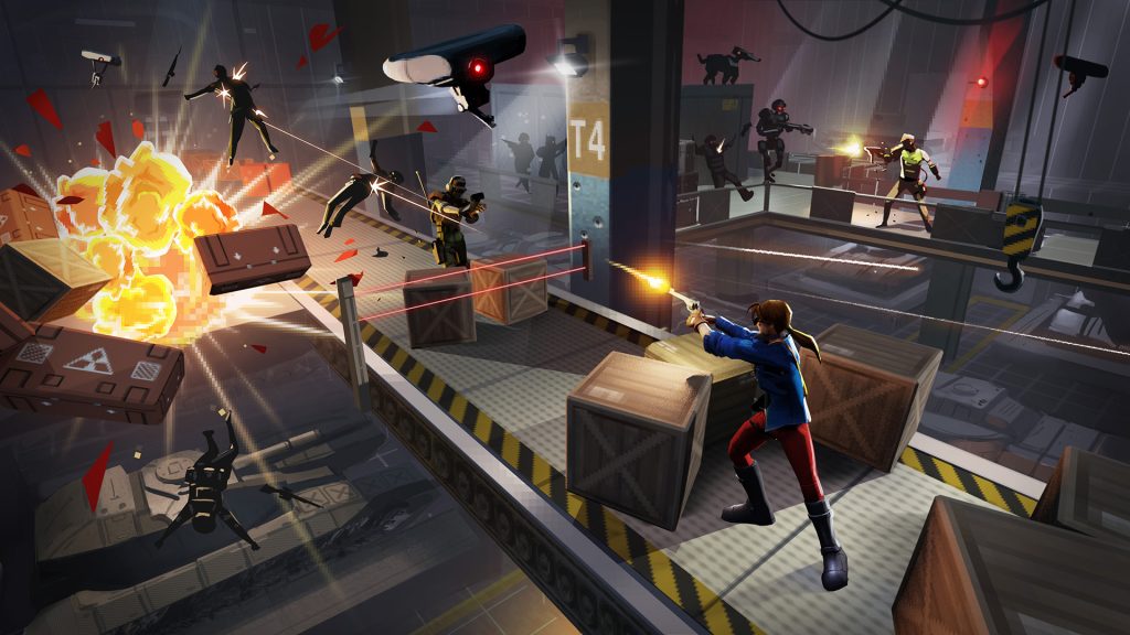
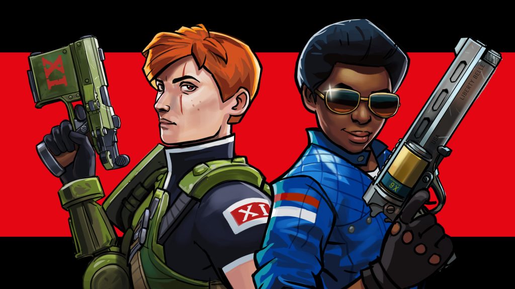
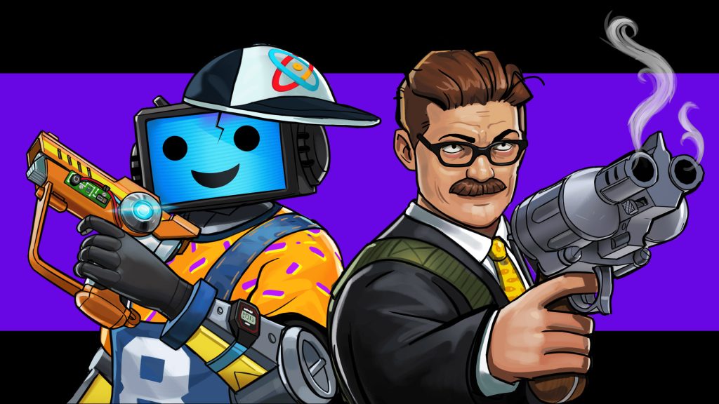
Key art created for the initial pitch for the game that would go on to become Under Cover.

Weapons

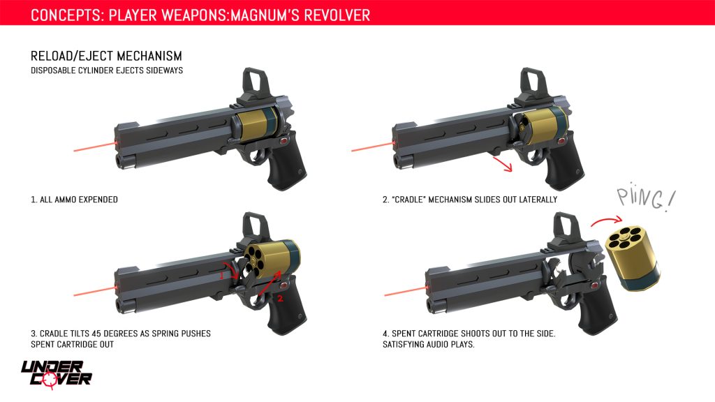
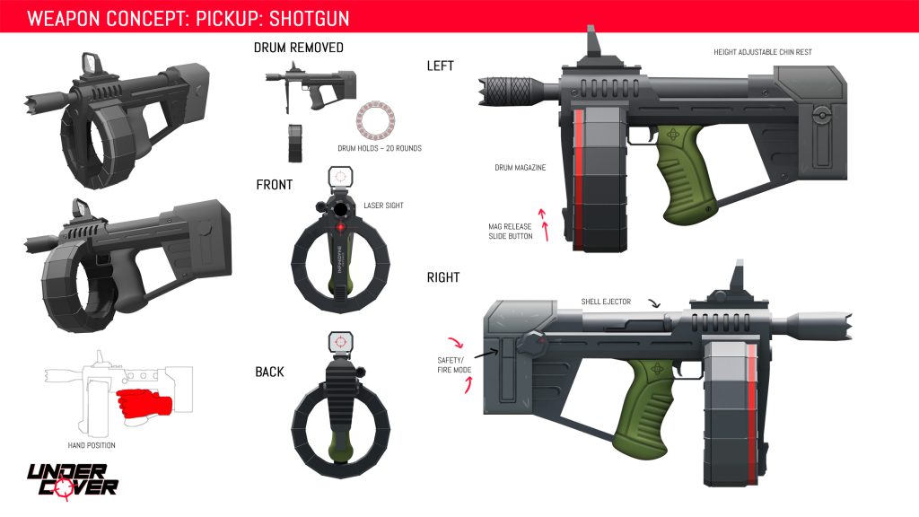
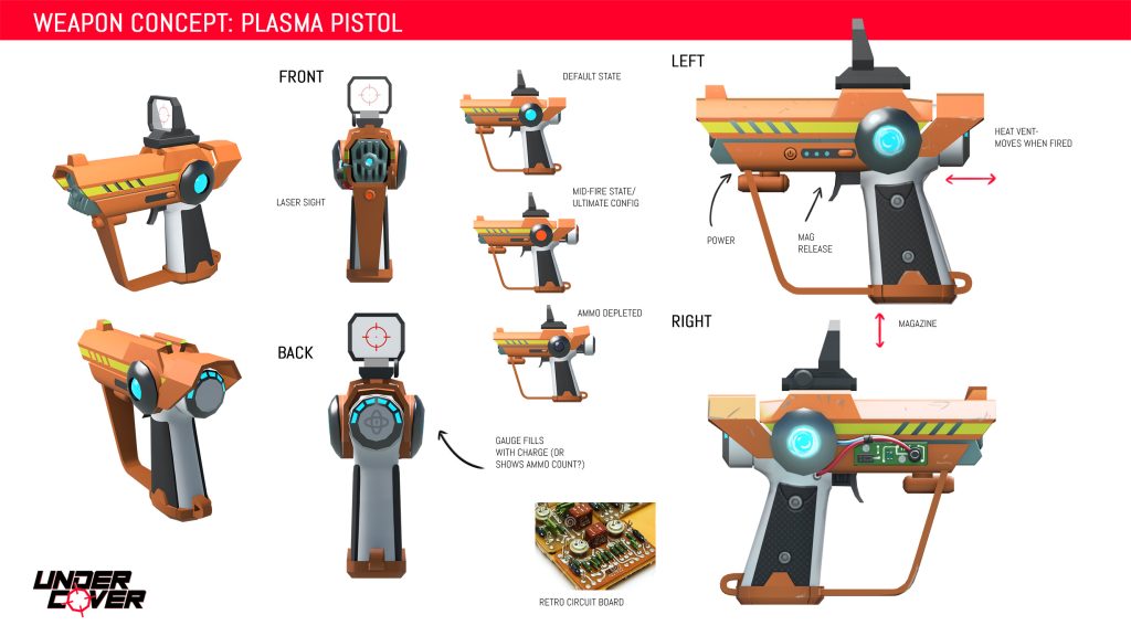
Let’s look at some weapons. Vitally important for a VR shooter! A lot of VR games involving guns have your hands floating weirdly and the gun pivoting all over the place. For us- pistol grip was king- because that one-to-one relation between hand and gun direction is what feels tightest in VR.

All two-handed weapons were therefore designed to have the hands as close together as possible- meaning bullpups usually- in order to mask the fact that really only one hand was controlling the gun direction.

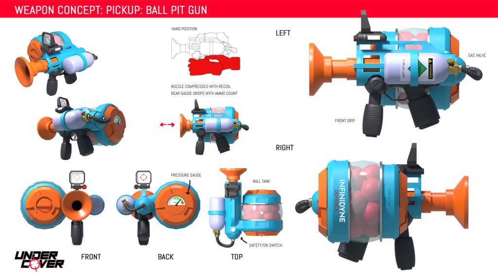
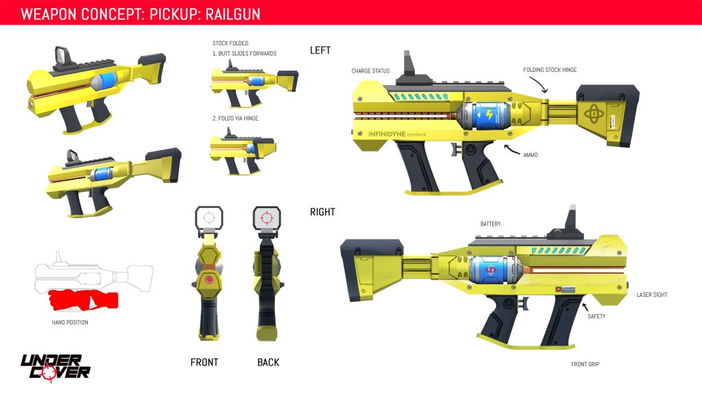
The concept process for the guns involved two stages- a rough ideation stage followed by a 3d block out in blender. I like to work this way because besides the fact that it’s fast and easy to tweak- with 3d you can be confident your design looks good from multiple angles. You can also preview the model in VR for an early sense of how the scale translates in VR.

8 Ball’s signature weapon

Most of the decals, logos and stickers were then added to the 2d renders later on in Photoshop.

Like any project- particularly with games- not all ideas make it through, and we were forced to drop a few gun ideas I’d love to have seen such as the railgun and the “business crossbow” (It fired pencils).

Characters

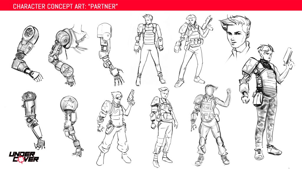
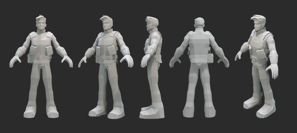
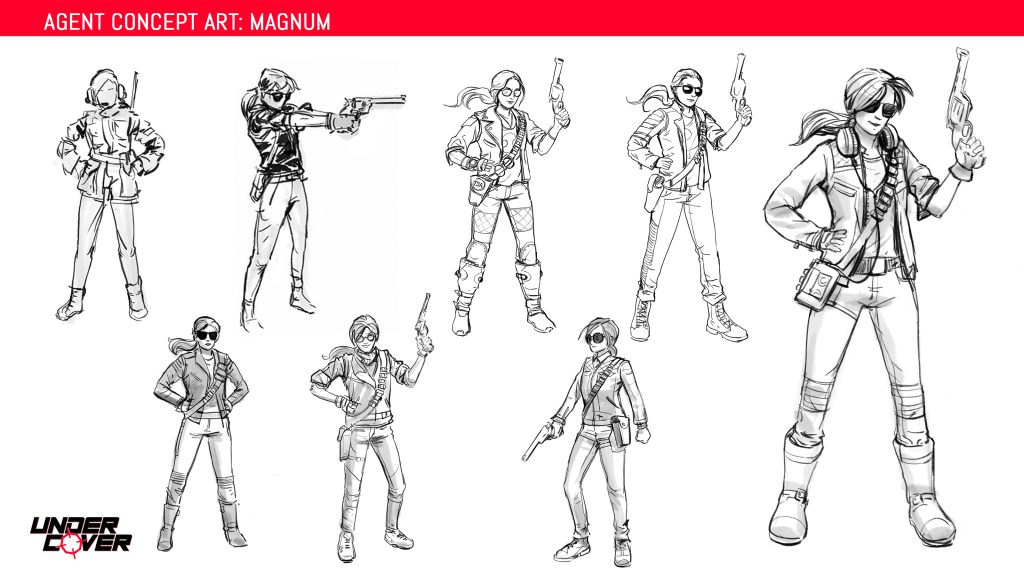
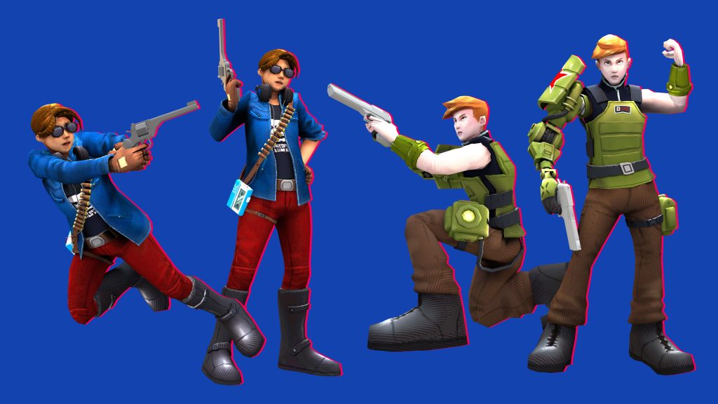
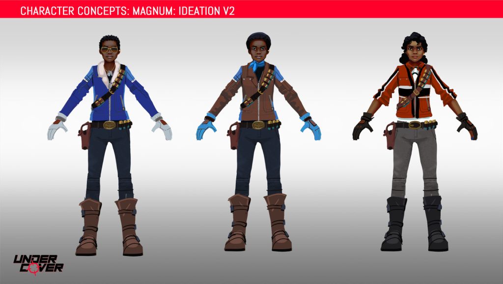
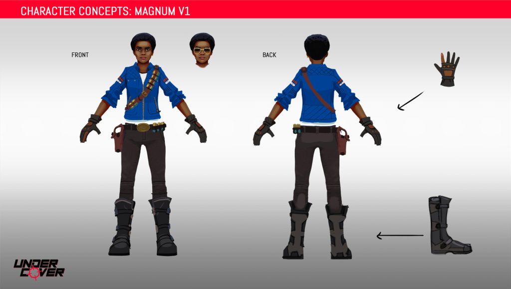
Now for some characters! Red Eye and Magnum- our two heroines- started off quite different to how they eventually ended up. Initially Red Eye was imagined as some kind of calm and collected Soviet super soldier, enhanced with a giant robot arm, while Magnum was imagined as a gung-ho American who shoots first and asks questions later. Because we didn’t have names for them at the time we simply referred to them as Comrade (Magnum) and Partner (Red Eye). This amused me considerably but was a bit confusing as even I had to stop and think about which one was actually which.

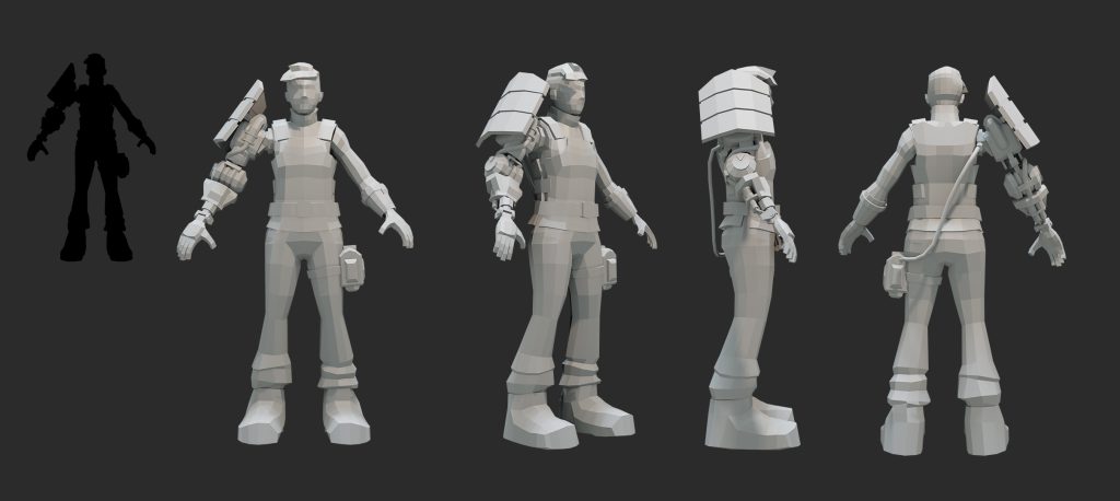
Here’s an early model of Red Eye- the chunky style drew inspiration from games like Timesplitters. We had to lose the pipe to the robot arm because it would be a nightmare for rigging and animation.
An early male version of Red Eye
The pre-production characters: Comrade and Partner!

Magnum was primarily inspired by action heroines from 80s and 90s films. She grew from a music-loving pre-production design where she had a Walkman and a set of headphones into a firebrand biker chick. The bandolier was a nod to Metal Gear Solid’s Revolver Ocelot.


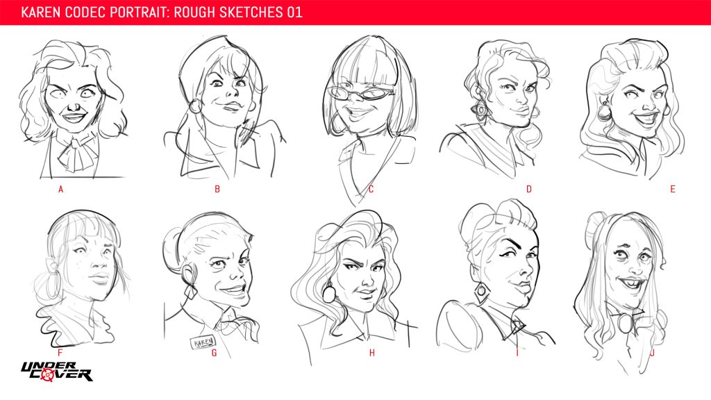
Some ideas for Karen from HR.
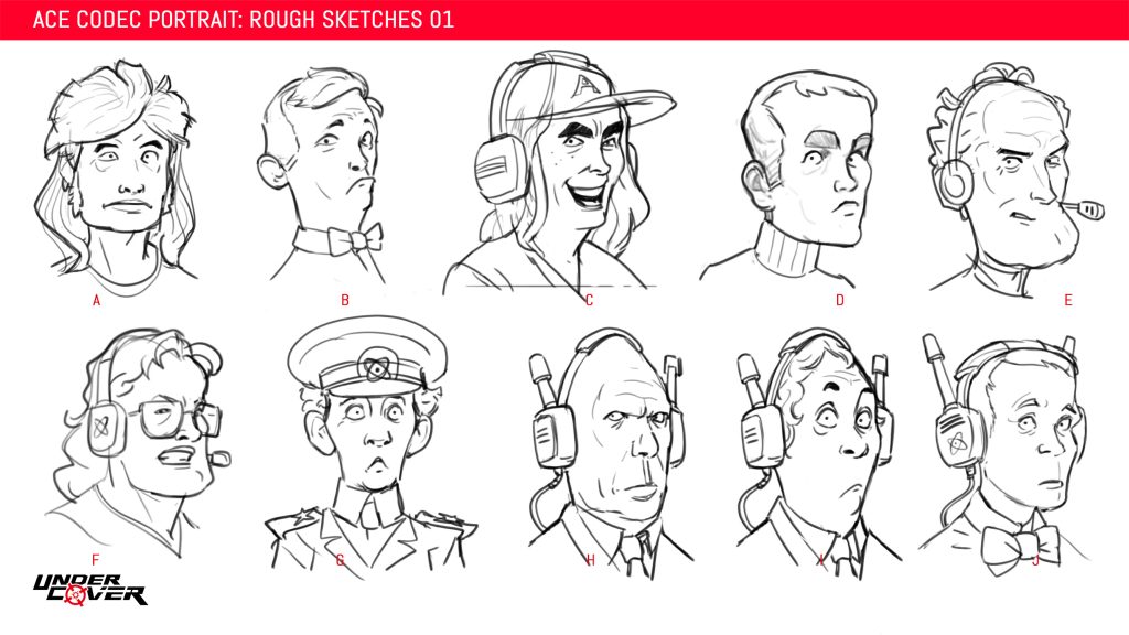
Ace AKA Jakaal

We also designed a cast of corporate middle managers to form the bosses of each level. They were only going to appear in the codec as headshots so we just needed faces, and since I love drawing faces I relished this task.

The final designs for Red Eye and Magnum

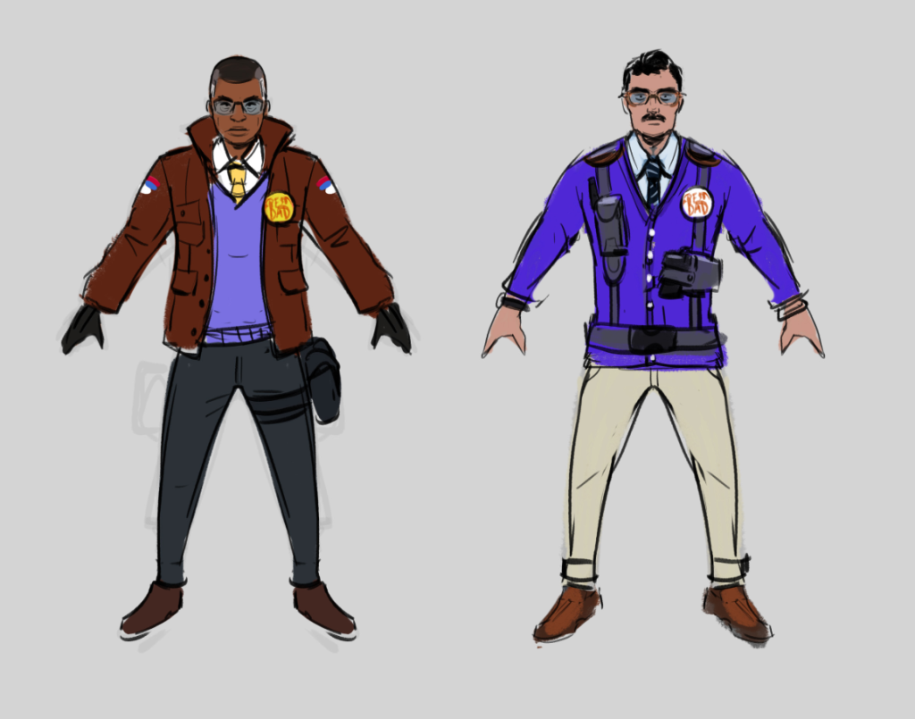
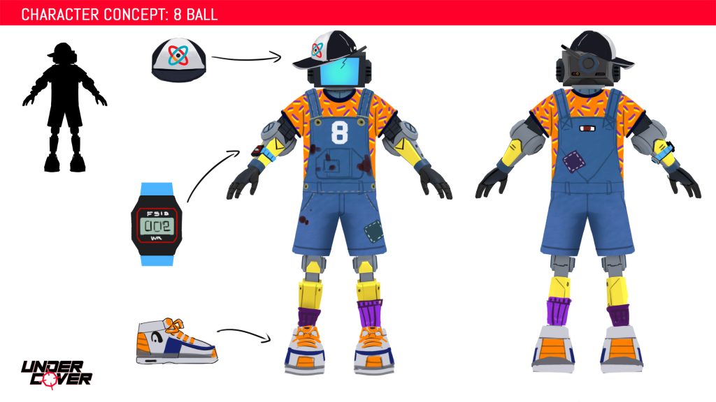
Alongside Red Eye and Magnum where Topman- the overworked Handler and workplace daddy for the protagonists- and 8 Ball- the defective defector and robot agent.

Topman- our secret agent “handler” character- could have been an alien, or inter-dimensional being at one point. He/they would whisk the player away to alternate dimension to complete some gunplay challenge. In this rough concept on the left side you can just see earth in the background of the central drawing.
Ideation for Topman- I still wish we’d gone with the idea on the left!
8 Ball was intended to be a kind-hearted, childish character in the body of a corporate Murderbot.
The final Topman and 8-Ball

Enemies

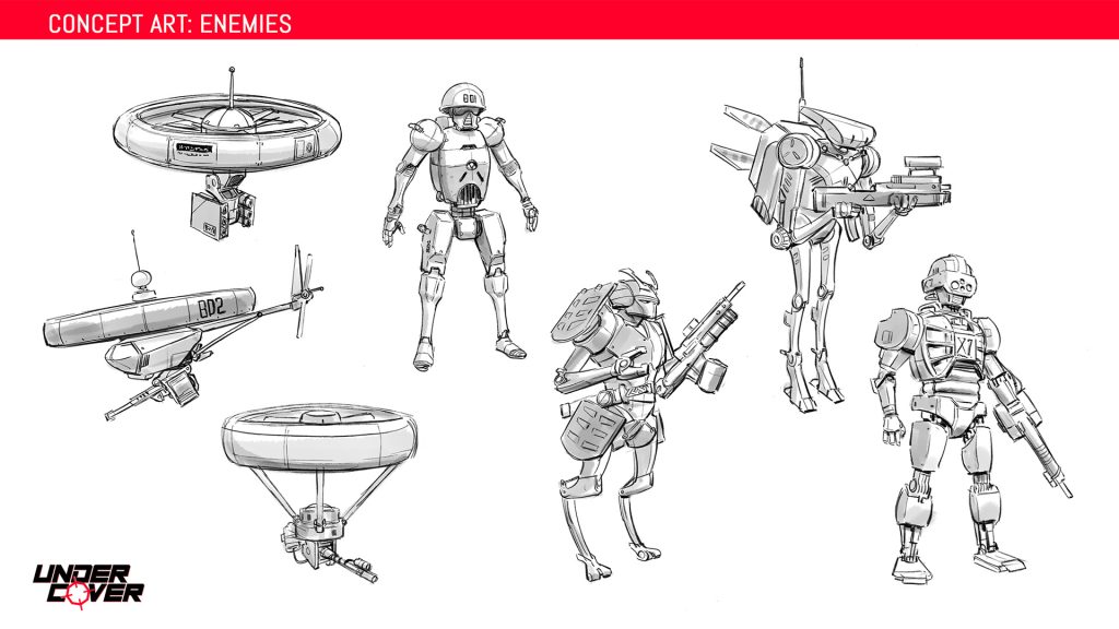
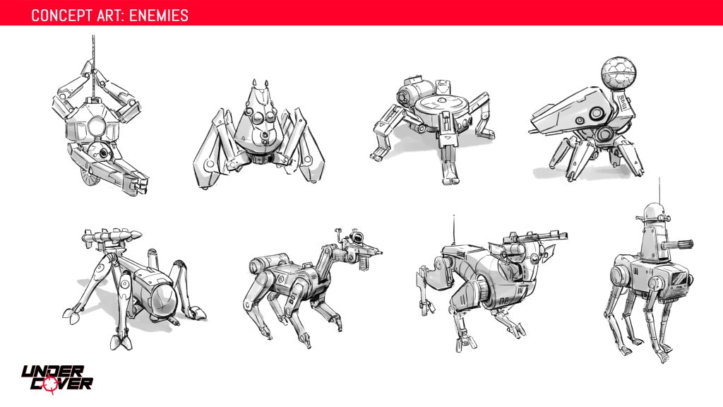
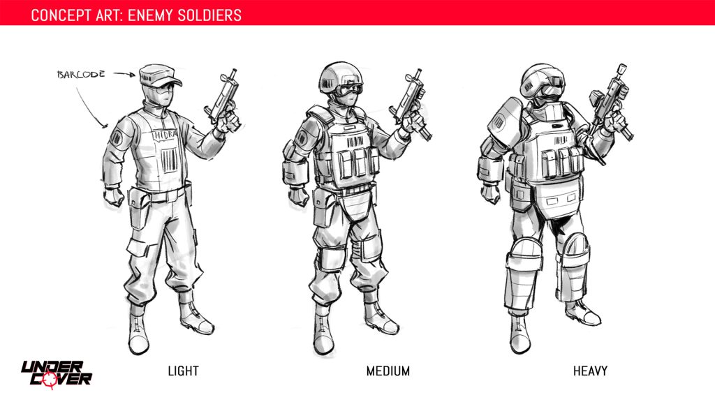
We had a lot of cool ideas for different enemy types early on- drone swarms, abseiling spider bots, and robot dogs with a cannon for a head. Ultimately these all fell victim to the brutal constraints of time and were cut, we focused instead on humanoid characters.

The grunts were to have barcodes on their uniforms- because to their employer they were simply products.
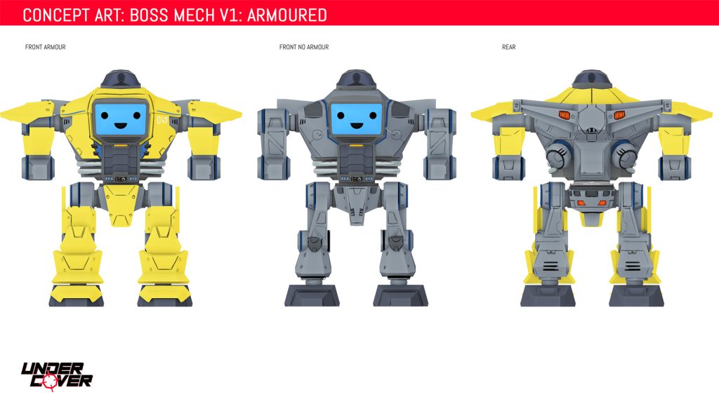
Infinidyne’s giant combat mech- each time the player faces a different boss the mech would be back with an additional new weapon to ramp up the difficulty.

Environments

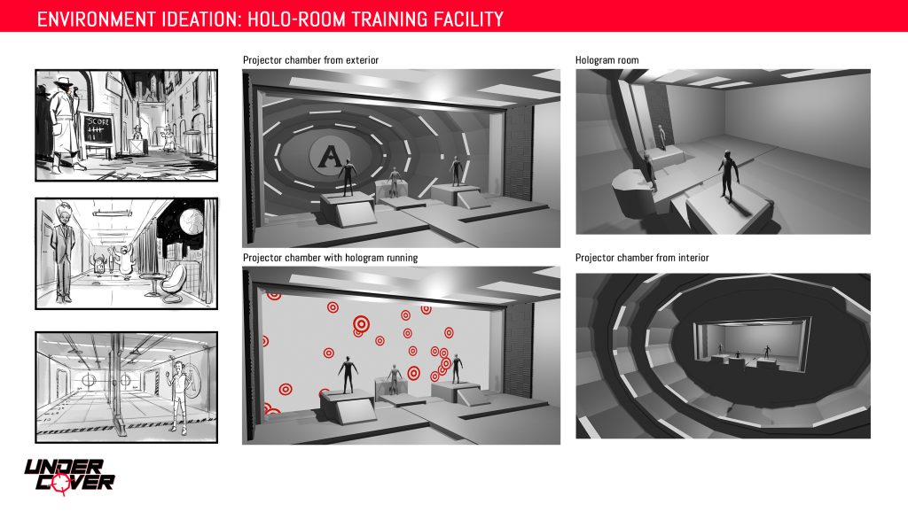
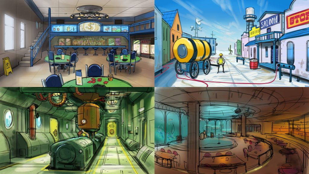
Early environment ideas- a corporate town and a secret underwater base for billionaires.

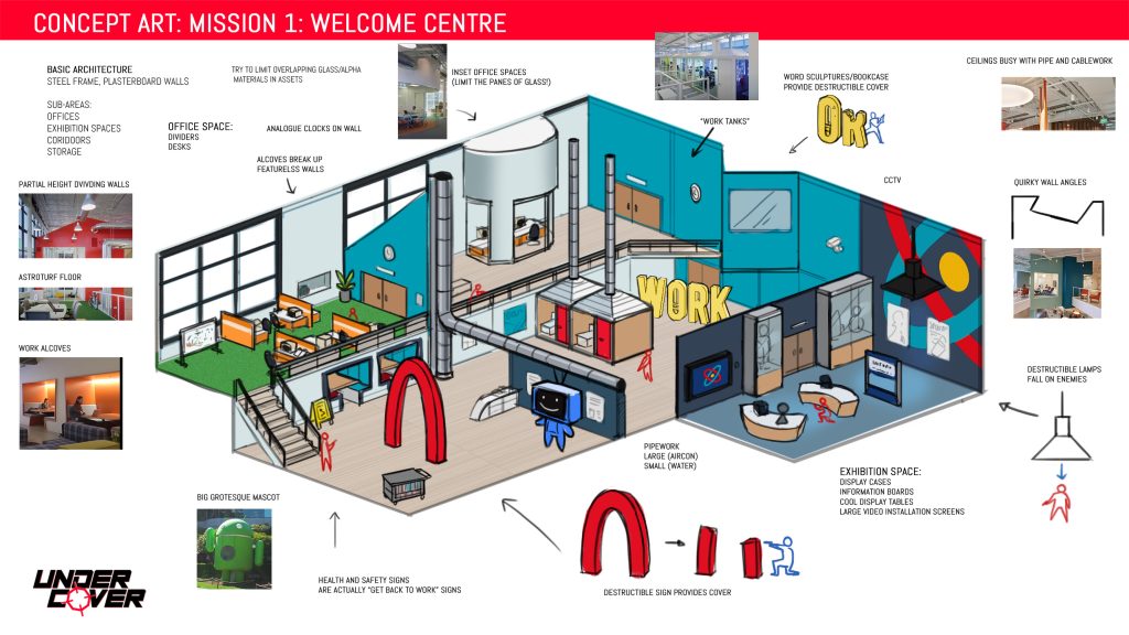
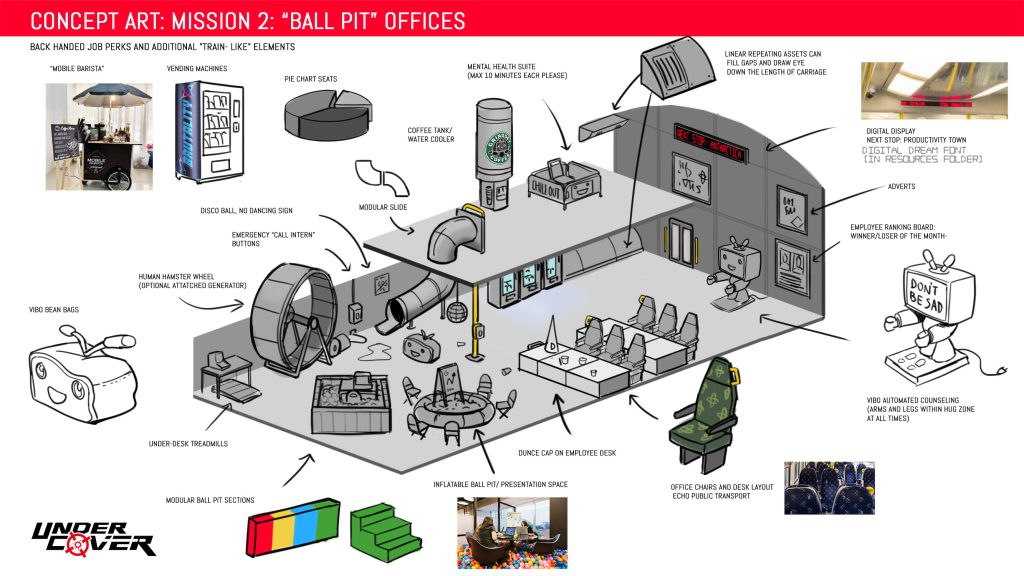
Finally, a few words about the environments. As a small art “department” working on Under Cover- we seemingly decided to set ourselves the biggest challenges we could in pursuit of the most bizarre and madcap environment ideas. No asset packs here! All custom. Where do you even go to get assets for a corporate casino train/ mobile co-working space? I’m pretty certain that every single 3d asset in the game was custom made.

From my perspective as concept artist- one of the hardest parts of creating the environment concepts was simply trying to think up enough waist-high, plausibly bullet proof objects to provide cover for the player! It’s harder than you’d think.

Working on Under Cover was a hell of a learning experience, and I’m very grateful to Gary and Luke over at Sigtrap for the opportunity to work on the game. I can also honestly say that there wasn’t anyone on that team that I didn’t like. Now that the game is in the hands of players I hope that if you’ve played the game and are reading this- that you enjoy it as much as I enjoyed working on it! Cheers.