
Having become completely sick of Adobe and thier general shithousery- I’ve decided to say “so long Photoshop” and ditch the software I’ve been using faithfully since I was 12 years old. Goodbye Photoshop, my abusive partner, I hate your guts.
Enter Krita! The open source painting program that I’ve been very impressed with for some time.
The Krita UI is a bit intimidating at first. It’s default setup is overwhelming and could definitely do with some refinement, but give it a chance.
I’ve been using it for just over a year now and I’m happy enough with the stability and the performance to use it for all my client work. Having dipped into Krita in the past and having issues with the brush performance I’m happy that the latest versions seem to be much better.
Reasons that Krita is better for illustrators than Photoshop:
- It’s free! You won’t be unable to open your decades of work the moment you stop paying “rent”.
- There are multiple brush engines. Most of which let you tweak many more parameters than in photoshop.
- It has the shape fill tool! You create the selection and fill at the same time. It’s a much better flow that “select” then “fill”.
- You can transform a selection consisting of multiple layers at the same time- this is absolutely game changing as far as I’m concerned, and I use it all the time.
- Plugins and customisation. The python API lets you automate so much.
- The assistant tool- you can have toggleable, editable perspective guides saved into the file itself.
- It’s designed for illustration, rather than photo editing. Plus it’s only going to get better- and add more illustration centric features. Rather than focusing on generative AI or photography.
Some teething problems I’ve encountered as a recovering Photoshop user:
- The eraser not being “E”
- The default UI is pretty overwhelming
- Clipping masks work slightly differently, and aren’t recognised when opening a .psd file.
- The text tool is currently inadequate. It’s clunky to use and it isn’t designed for multi-line text. From what I understand a better version is currently in development.
- There’s a separate delete for layer and layer content.
- I miss the “replace colour” tool.
Things I thought would be a problem and aren’t:
Handling files for export. I thought I need Photoshop’s precision with guides or colour management or something? Nahh.
PSD compatibility. Clipping masks aren’t recognised when opening .PSD files. you can just toggle them on yourself. No big deal.
Losing my extensions. Well, Krita does all that stuff already: I don’t need lazy Nezumi because Krita has assistants and brush smoothing options. I don’t need brusherator because Krita lets you tag brush pre-sets and assign shortcut keys with the ten brushes script. I don’t need toggleator because I can easily write a python script (or get AI to help me) to do the same thing, plus more.
Performance and stability. Undeniably photoshop still has an edge here. However Krita is definitely at a level I’m happy with now, which past releases where not. There’s also ongoing development to keep refining performance.
Some recommendations for former photoshop users.
For me- the biggest friction point when switching to Krita was the way that the eraser is not a separate tool, but a mode applied to whatever tool you’re using.
For instance, you can go to use the fill tool- and having used the eraser brush last- you fill the page with “erase”. In other words you erase everything. Pretty frustrating.
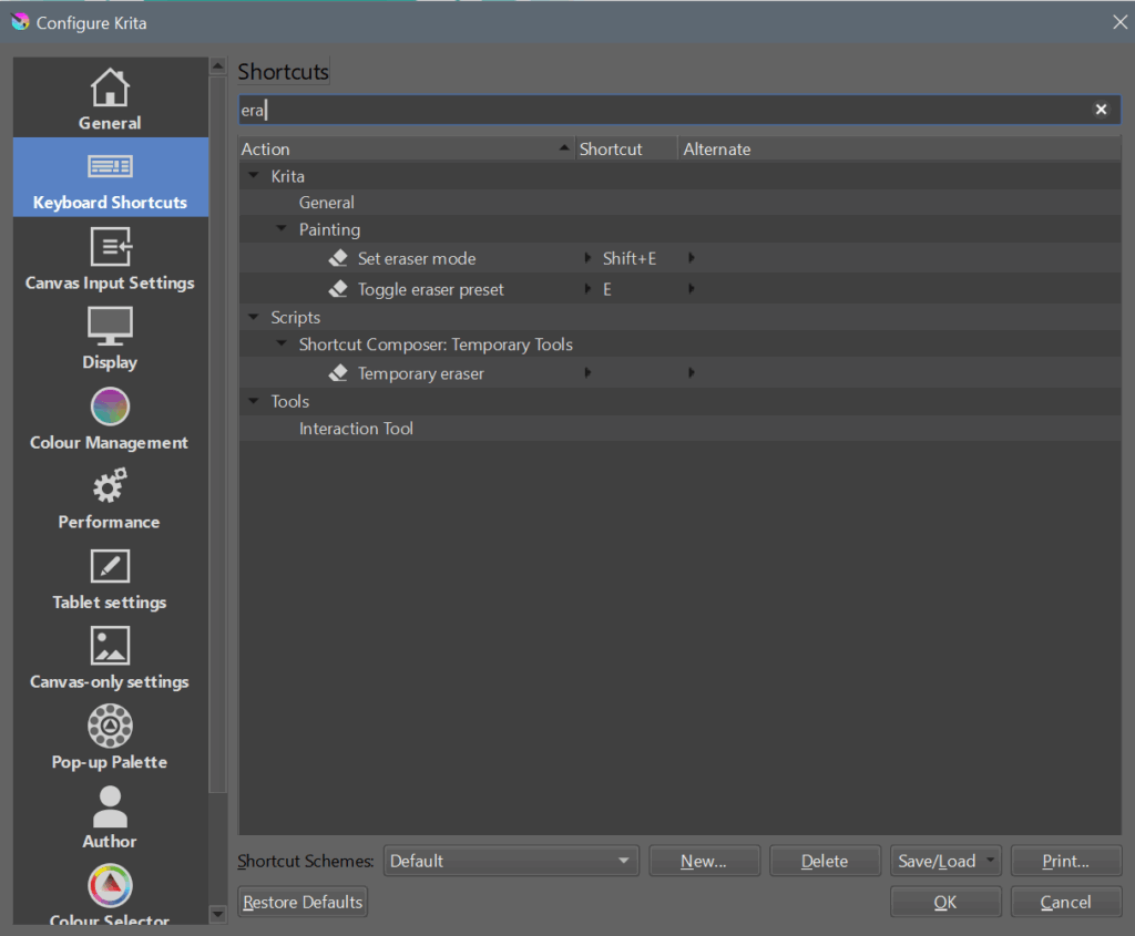
This is something you just have to get used to. If you’re handy with python you can script some workarounds, but ultimately it’s a different paradigm for how the software works. One thing you can do to lessen the pain is to set a custom shortcut to toggle the eraser preset:
Another recommendation is to use the photoshop-compatible shortcut scheme- and to read this guide: https://docs.krita.org/en/user_manual/introduction_from_other_software/introduction_from_photoshop.html
In my opinion the most important bit is the difference in how Krita handles layer compositing- which explains why opening a .psd with certain clipping layers and blending modes will give unexpected results: https://docs.krita.org/en/user_manual/introduction_from_other_software/introduction_from_photoshop.html
Obviously it takes time to overcome old habits and conventions- but for me it’s been totally worth it. I don’t want to sugar coat things- Krita is definitely not perfect right now- but it’s getting better, and tools are worth it.
If you’re on the fence- give it a try for few weeks then decide: https://krita.org/


