
I thought I’d make a post to show off some of the book covers I’ve designed and illustrated in recent years, as well as talk about the process of creating them.
All these are in collaboration with independent authors self-publishing their books. I’ve had the privilege of working with many passionate writers and creators over the years, and am grateful for the trust people place in me to do the cover for a project that may have taken years to create!
A lot of these commissions have come via Reedsy: https://reedsy.com/tom-mcgrath
I’ve had pretty good reviews there (so far!)
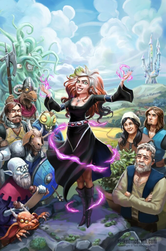
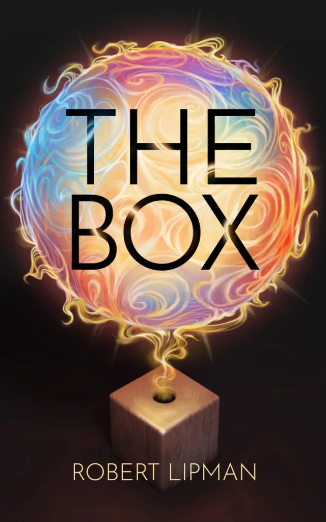
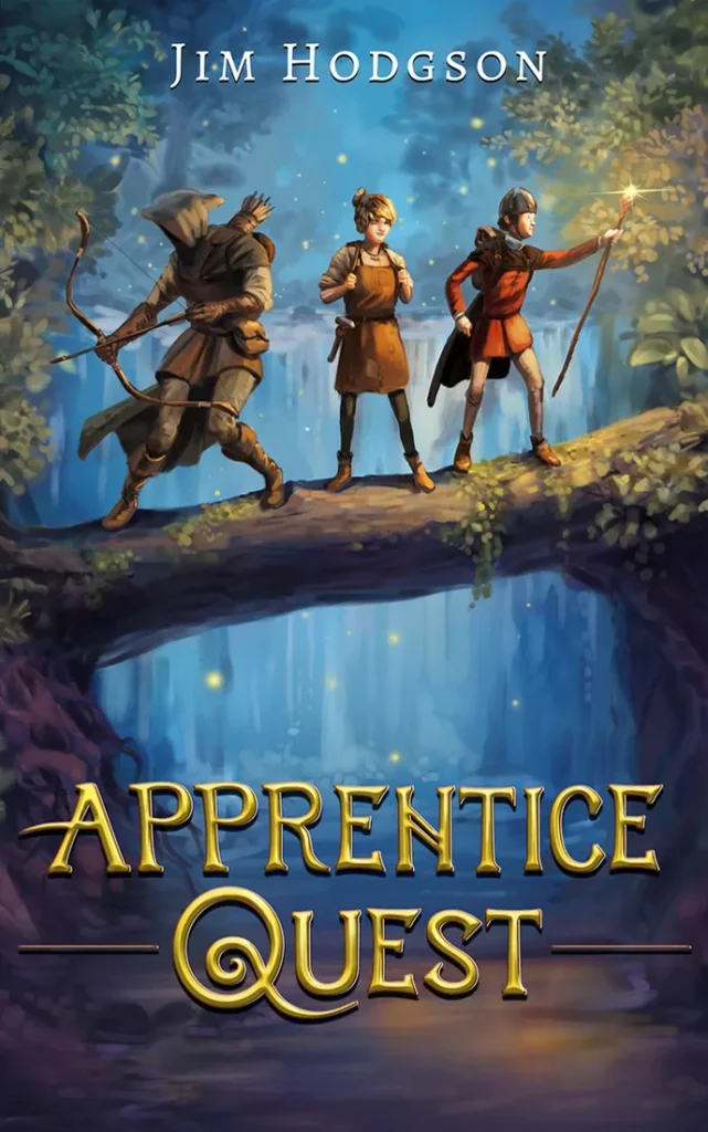
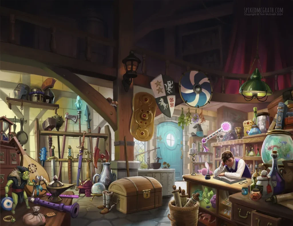
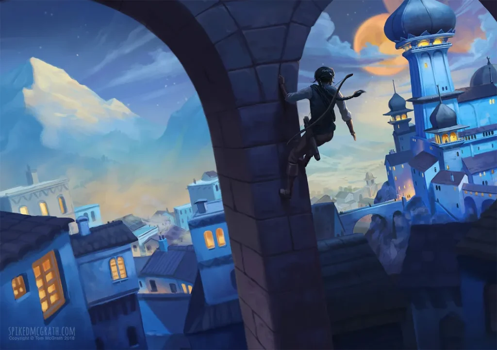
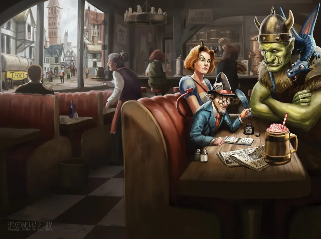
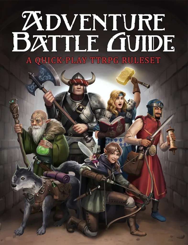
Here’s a few I’m particularly proud of- some complete covers and some illustrations from different books I’ve worked on:


How the cover creation process goes:
We start with a brief- some notes, or maybe a few chapters from the book so that I can get a feel for the project and the type of thing that might work for the cover. Some people are kind enough to send me the whole manuscript. Though I rarely have time to read a whole book- I’ll always read a few chapters and any notes I’m given.
After reading up on the project and discussing ideas with the client- I always start by drawing up some thumbnails of potential options for the cover. Every cover design has to work at a small scale so that it draws attention even in it’s tiny product thumbnail form, so I’m keeping this in mind when designing. Big shapes, clear silhouettes and graphic forms work best. Usually I pick the best one or two then send them over to the client for review.
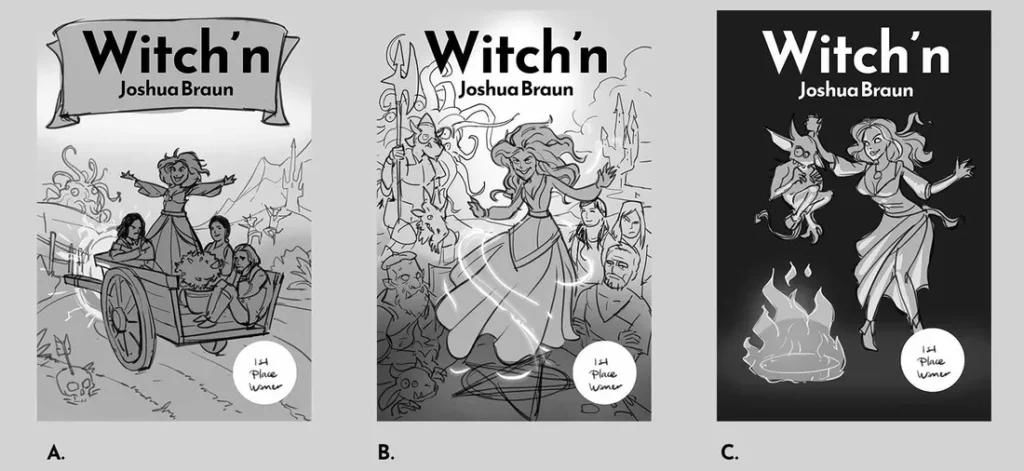
Once they’ve picked the one they like best- or some variation on the thumbnail- we proceed to the next stage- which is usually a colour plan. As before- I start with a few options and pare them down to the strongest. Again, the client gets a chance to review and direct, and once they’re happy we proceed to the next stage.
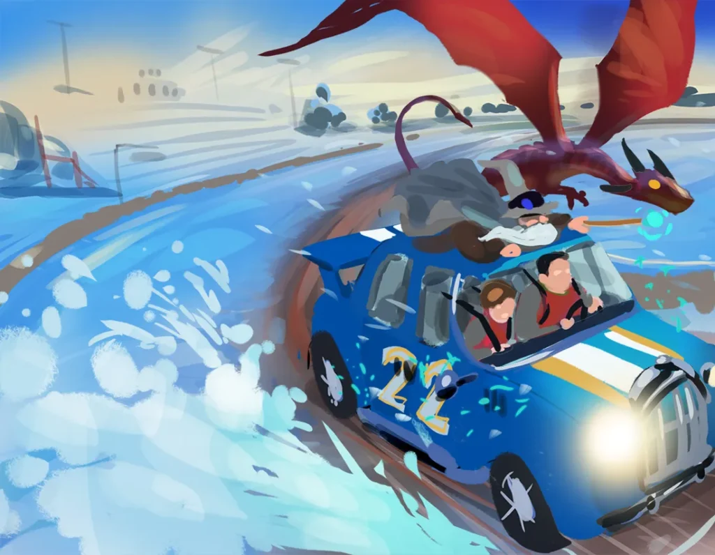
Throughout the process I’m thinking about the ultimate purpose of the design. There’s a always a tension between the most creative ideas and the reality of what a cover design is- which is marketing. It pains me as an artist sometimes, but the commercial element is extremely important to a successful design. Supposing you created the most avant-garde, creative and personally fulfilling cover design possible, uploaded it to Amazon and waited for the sales to roll in? In reality people who enjoyed your genre of book would almost certainly scroll past it because they didn’t know it was for them! A potential buyer seeing your cover for the first time with no other context is always making a snap judgement about whether it looks like the kind of thing that they (or their intended reader) actually reads.
The frustrating (in my opinion) reality is therefore that you have to be informed by what everyone else is currently doing- so you can give the right context cues about the target audience. If you can tell the genre and the target audience straight away then the design is doing it’s job. This often frustrates authors too, because nobody likes to put their work in a box. The fact is though that it helps a great deal to have an audience in mind!
The final illustration stage is next- where I go away for (usually) a week or two and paint the final artwork. This is where I can start to relax, because at this point I know what to do, and I just have to do it! There’s one last chance for review by the client before this stage is signed off.
Once the illustration is done- it’s down to the last part- which is usually graphic design. This involves placing the text, typesetting and styling, along with any other elements like logos. Again, it’s a back and forth with iteration until the final result is achieved.
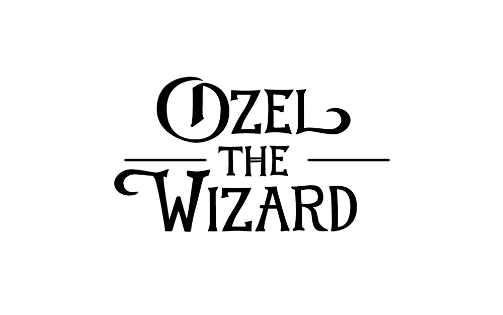
Sometimes there’s custom lettering involved- which is an involved process in it’s own right.
Once everything is approved- I process and deliver the final files. Usually I’ll stick them in a .zip file on google docs, or just send them directly if the file size isn’t too big.
If anything needs tweaking- then I’ll sort that too. Often when publishing to Kindle direct or Ingram Spark people find that the template needs to fit exact dimensions that account for the page number and the paper type- so that often requires a final adjustment.
If you’re interested in having a cover designed, or need illustration for a project- you can contact me here and I’ll be happy to help: contact
Alternatively, if you’d like you can also request a quote over on Reedsy you can do that here: https://reedsy.com/tom-mcgrath
Cheers!


