General Wisdom for Artists in 2025

I first started these General Wisdom for Artists posts over ten years ago! Analytics tells me that people have actually been reading them!

Perhaps this is too personal, too abstract, too disparate. I don’t know. I’m writing it to get my thoughts in order as much as to help others. Here we go:

Fluency

There exists a type of learning that can only be built up through repeated doing. Sounds obvious, I know. But the point is that all these blog posts and art tips are only a skeleton upon which the muscle and sinew of actual experience must grow! I call this type of learning “Fluency”.

In the same way you can learn a new language and become fluent- so too can you learn the fundamental principles of art and become fluent in each of them. Think of it this way- you can speak a new language by consulting a phrase book, or you can become fluent in it. It’s the difference between book-learning and true understanding.

You don’t know what you don’t know.

Supposing you recorded your workflow for a few different pieces and put them on youtube. Then you watched it back, maybe comparing your approach to other artists. You’d be struck by the particular patterns you follow and the particular ways you do things. You might also notice a few repeated mistakes.

You have a method, skillset and strengths that you probably haven’t articulated to yourself before. It’s to your benefit to understand these. You don’t know what you don’t know, and tackling your blind spots will make you a better artist.

This connects somewhat with the fluency idea expressed above- because sometimes you can be fluent in doing things wrong! Having looked over some of my recent artwork I know that messing up perspective and tonal values comes to me as easily as riding a bike. I thought I had these things sussed out years ago. It’s something I have to work on I suppose.

Enthusiasm

I haven’t done much digital work for myself in recent years. I used to fill sketchbooks, digital and traditional- and even that has stopped. Life has had ups and downs- and the art “industry” is currently in middle of an existential crisis with generative AI. Or maybe it isn’t- who can say? Personally I don’t know what to think anymore.

It’s a strange time to be a digital artist. We’re sort of still useful, but who knows how long for? I’ve painted book covers for clients who originally used generative AI- but found that the results turned people off by being too artificial- too obviously AI. I occasionally get given AI references that are better than I could ever paint and get asked to recreate it.

I’m rambling a bit but the point is that it’s hard to devote myself to something that used to have such obvious value, and now might not. Should I be re-training as a plumber right now?

The one consistent joy for me has been plein air painting- which might be less about the art and more about the act of getting out into the world and doing something purely for the hell of it. Do what you love, right?
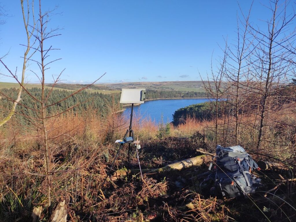
It’s almost always worthwhile to leave the house.

Some final scattered thoughts

Present your work nicely. Consistency is key. I rarely follow my own advice on this one.

Automate unimportant decisions. Life’s to short to spend lots of time on the minor things.

Finish what you start. I’ve been prone to making lots of little incomplete drawings and paintings over the years, and none of them are good enough enough to show to anyone, but also not original or interesting enough to satisfy myself!

Don’t skimp on hardware- I bought an Ipad pro in 2021 and have used it every day since. It was expensive, but it’s been worth it. The lenovo tablet I bought just a couple of years earlier has mainly sat in a drawer because it’s terrible. The price difference wasn’t even that much!

That’s it for another few years I think.
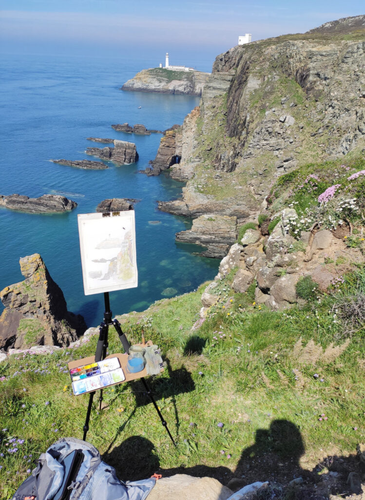
Watercolour en plein air

I absolutely love plein-air painting in watercolour. Basically- painting outside on location. I’ve been doing as much as I can and it’s still just not enough. I should really be doing it today instead of this!

A beautiful spot near South Stack lighthouse, Anglesey.

The results are usually not that impressive- my watercolour skills have a long way to go- but the experience of doing it is always worthwhile. When it goes well it can turn a good day into a great day.

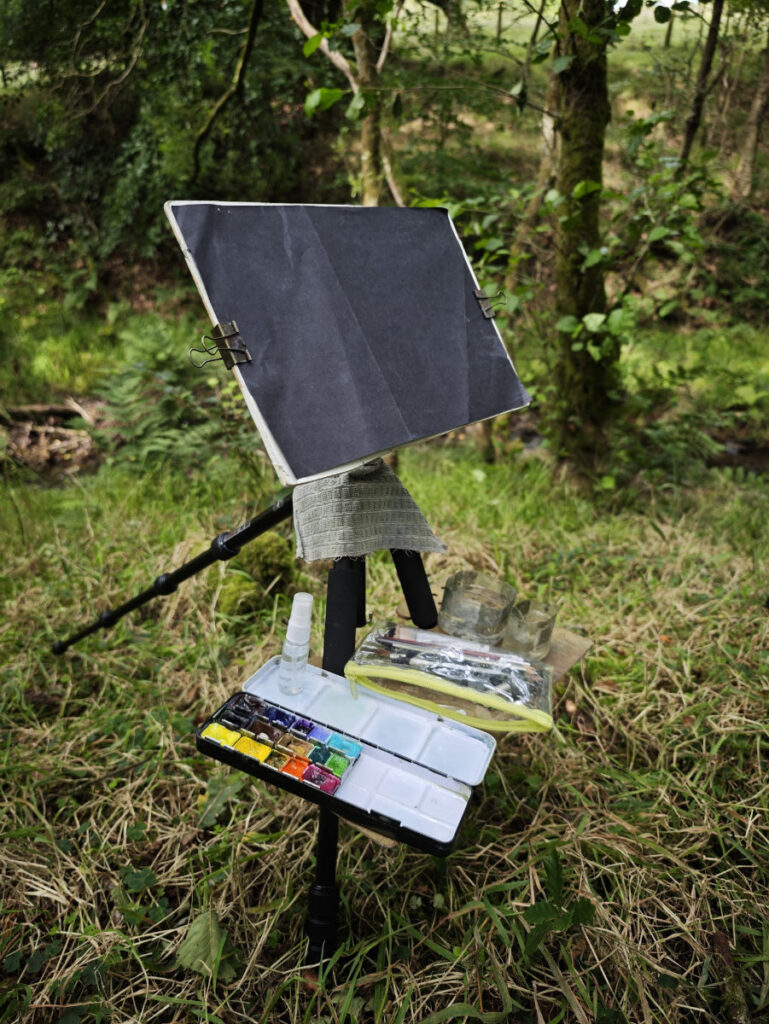
I’ve been experimenting with different setups- my current setup is based on James Gurney’s tripod setup but is constantly evolving.

It basically consists of a lightweight tripod- a board screwed onto the tripod’s camera plate, and a small shelf made of some more board that hooks around the legs of the tripod. My water pots (old plastic bottles with a metal hanging bracket glued on) and paint box are clamped onto the shelf with magnets. I also usually clamp a rag on with a bulldog clip, and clamp a piece of scrap paper over my painting surface to protect it before putting it my bag. A small section of camping foam roll makes for a portable seat. The whole lot can be easily packed up into my backpack.

Thus far I haven’t had the courage to paint in any busy places- I prefer the most wilderness-like places I can find! The idea of painting with people looking over my shoulder is not very appealing.

Mistakes made and lessons learned:

Don’t forget your stuff.

This is a big one. If you have a dedicated plein-air bag with everything ready to go- then you’re less likely to leave something important behind.

Choose a suitable subject.

You are not a camera. Don’t try to be one. There’s a place for photorealism, but it’s probably not when you have limited time, minimal shelter and the light is constantly changing! I’ve found that simpler, more graphic subjects tend to come out better.

Do a decent drawing first.

A good drawing makes for a good painting. It’s very tempting to rush to the fun bit with all the swooshy colours, but knowing what things are and where they go saves you a lot of trouble later on.

When I say a “good” drawing- I mean a clear drawing that simplifies the scene and will help you understand where one thing ends and another begins.

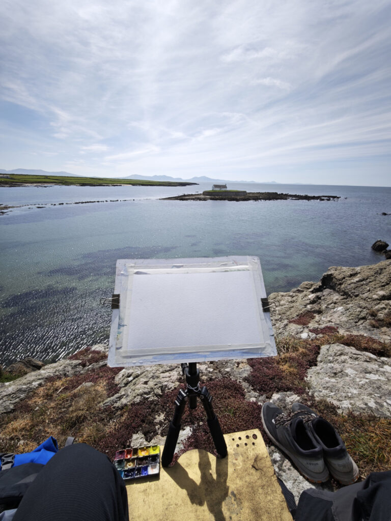
Eglwys Cwyfan, Anglesey. Top tip: take your shoes off to feel more at home anywhere.

Prepare for the conditions!

Kind of obvious, I know. It will probably surprise no one to find out that the final artwork is often better when your fingers don’t hurt from the cold, and shivering is preventing you from making any accurate marks. On the other hand- blinding direct sunlight doesn’t make things easy either.

Then there’s the insects! Not only do mosquitoes, ticks and horseflies love the taste of plein air painters, but every other insect seems to enjoy sitting on the bright white, often damp, surface of your painting.

A few extra common sense items solve most problems:

  • Season appropriate clothing- often including gloves and hat.
  • Sun cream.
  • Insect repellent.

Boudica’s Gambit: A Debriefing

If you’re an artist and want to understand my process before AI replaces us all and makes this redundant- then this post may be of interest to you. Everyone is welcome of course, but frankly, this is mainly here for my own benefit. You’d be surprised how much you forget once a project is completed!

I started this picture with the notion that it would be cartoonier than my other work, and therefore simpler. I’d pay homage to those “Manga-looking” JRPG games I loved as a teen and try to capture that style. There might be an element of that in final result, but ultimately it’s my usual obsessive approach that won out.

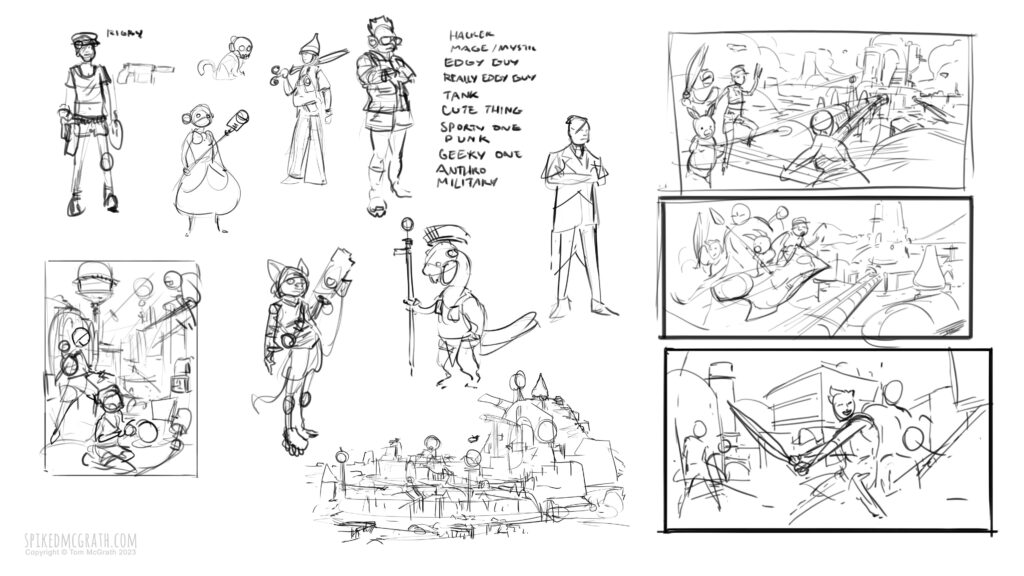
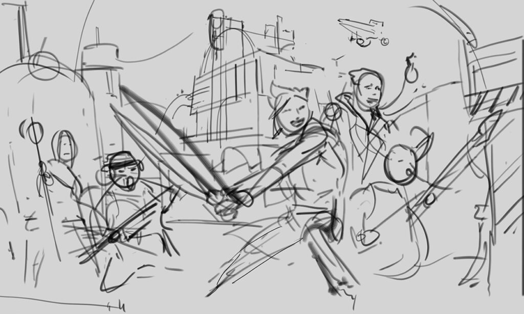
Perhaps because I thought it would be simpler, and because I was excited to just get stuck in- I launched into the picture with a pretty underdeveloped thumbnail sketch. I was confident I could work it all out as I went. That’s the beauty of personal work after all!

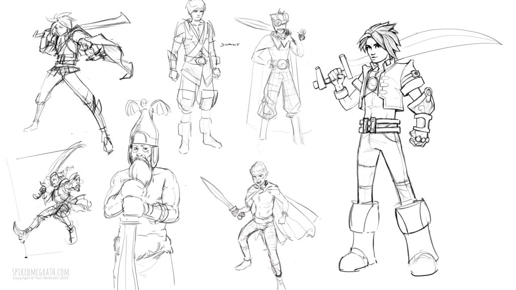
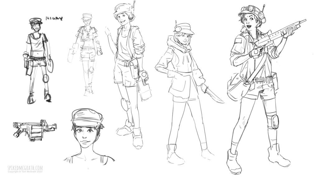
After choosing my loose compositional idea I began to explore ideas for the individual characters.

A backstory to the world began to develop- an idea that included cold war Berlin- a city divided by opposing powers, but this time being a Celtic inspired city occupied by a more advanced magi-tech Roman empire.

When I started this picture I wasn’t totally comfortable with my ability to pull off a big complex city scene and wanted to really challenge myself to produce something ambitious. I also wanted to incorporate some Celtic elements into the design, and spent some time gathering references of Crannogs stone circles and hill forts.

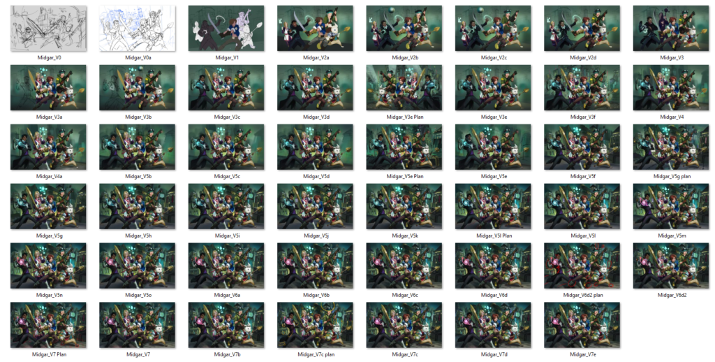
This picture progressed over the course of two-and-a-bit years, and was juggled between Photoshop, Krita and Procreate, PC and iPad. I started thinking about this in late 2019, and finally wrapped it up in mid December this year (2022). As I worked on it I saved out the latest iteration to record the progress. Later in the process I started setting each new image as my desktop background as motivation to keep the image progressing. I ended up with 47 iterations:

The progress video

A few key take-aways for me from this project:

  • Keep your perspective grid on a layer inside the file itself, so when you pass the file from program to program it stays there.
  • Make notes or a reference model to keep track of the light sources. You forget what they are after a while.
  • Krita tops photoshop for painting. Photoshop makes everything harder than it needs to be with it’s archaic brush engine.
  • The start and end of a painting is super fun. You’ve just got to push over that middle hump!

Barbel- Notes from the character creation process

Barbel- my Overwatch style character design- is finally complete. Two and a half months of focused work has left me with something I’m relatively pleased with. There’s always room to improve though, and one of my favourite ways of doing that is to review the latest project and think of how to get better results next time.

https://skfb.ly/6vSnC

The idea for Barbel was born sometime in early 2017- I knew I wanted to make a 3d character in the style of Overwatch, but I din’t have any specifics beyond that.  Then one day, the idea came to me- almost fully formed- which never happens usually and is not be relied upon.  I wanted a giant catfish armed with a trident like one of those Roman gladiators. I could see him hunched there in my mind’s eye doing some kind of daft “play of the game” pose and making weird fish noises. He had a space helmet full of water though. I ditched that early on.

What I learned:

In concept art 3d is superior to 2d.

Sketching is obviously a very fast way of presenting ideas, but the fact is that some ideas just don’t occur to you simply because you’re thinking in a 2d way.

When you have a lump of 3d clay and you can quickly manipulate it without preconceptions- you begin to think in a more 3d way and consider how forms twist and turn as they travel through space- how the silhouettes look from all angles rather just one or two key profiles, or how things overlap. All this stuff is obviously possible in 2d- it’s just harder.

It’s also pretty tedious to redraw a character from the back or the side, just so you can see a few areas to decide how they’ll look. In 3d you have one model- and you can see any angle you desire and what’s going to go there. Playing around in Gravity Sketch and Oculus Medium led to a few happy accidents that helped me overcome design challenges I was having at certain points. Which leads me on to my second point…

VR is the best way to concept design in 3d.

Wherever I thought that the 2D concept was underdeveloped or not clear enough I would play around in Medum or Gravity Sketch and quickly come up with a solution. Arguably you could use Zbrush or Maya or something traditional, but the immediacy of reaching out and drawing a line in the air, of genuinely working with three dimensions of input rather than the two offered by the monitor screen, of  being completely immersed in a world where only you and your work exist- is pretty damn special! VR may be a little clunky at the moment, but it more than compensates for it by allowing for a state of flow that surpasses traditional modelling.

It’s also really fast. The aforementioned three dimensions of input mean you don’t have to move the camera every time you want to do a simple operation such as moving an object along an axis that isn’t perpendicular to the viewport. True stereoscopic vision means you don’t have to move the camera to get an understanding of form either. On top of all this- you can move, rotate and scale objects all at the same time, even as you move your view around.

Colour and form should be designed together

Good colour design requires you to balance different key colours, secondary colours and accents. If you have a model ready to texture and you haven’t decided how to balance these colours, you may find some areas of colour or material are bigger or smaller than you’d like, and it’s too late to change it easily.

By contrast- if you deal with colour and form at the same time you’ll get a much more immediate impression of how your design is going to look when it’s finished and textured. If you deal with this at the concept stage you have a lot more freedom to play with the design so that the hierarchy of shape and colour works as you’d like.